Best Patches for Jacket Pockets That Actually Fit
Learn which patch styles actually fit a chest pocket, how to size and place them, and keep the pocket usable while building a balanced jacket front.
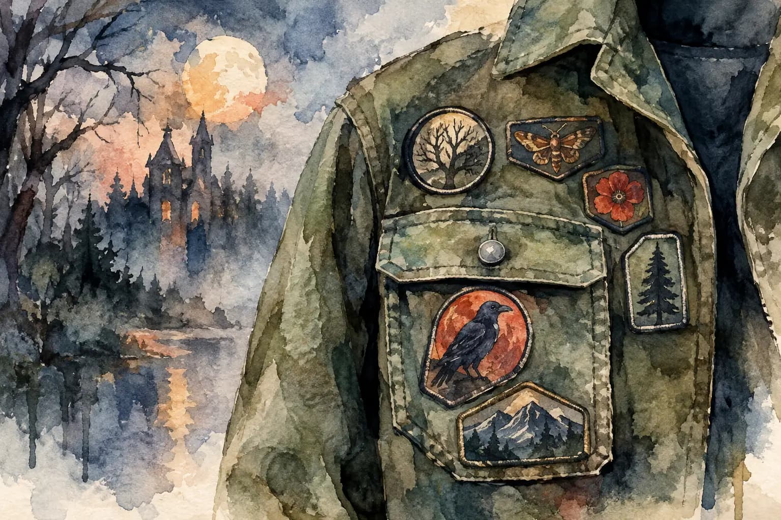
Watercolor illustration of a jacket chest pocket covered in shaped patches of a crow, moth, flower, tree, and mountain, beside a moonlit forest and castle scene.
A chest pocket is a small piece of real estate with a big visual job. It sits near the center of your battle jacket, gets seen first, and can make the whole front feel intentional or overcrowded. The best patches for jacket pockets are not automatically the rarest patch in your collection or the largest logo that can technically fit. They are the patches that respect the pocket's shape, seams, flap, and function while still saying something about the music and scene you carry with you.
That does not mean there is one correct pocket setup. A clean black woven logo over one pocket and a crooked, sun-faded punk patch over the other can both look right. Your jacket belongs to you. But planning around a few physical limits before the needle comes out will save you from folded corners, blocked pockets, and a front panel that feels heavier than the back.
What Makes a Pocket Patch Work?
Pocket patches work when their format matches the available surface. Most denim jacket chest pockets are narrow rectangles, usually with a flap at the top and vertical seams at the sides. A patch that looks great in your hand may lose its impact once the flap cuts through the artwork or the sides wrap around the pocket.
The strongest choices have a simple, readable design at a small scale. Think bold band logos, high-contrast symbols, short text, skulls, runes, small crests, or a clear character illustration. Fine album art, long tour-date lists, and dense full-color scenes usually need more room than a pocket can give them.
It also helps to decide whether the pocket should remain usable. Plenty of battle vest builders sew patches directly over pocket openings, especially when the pockets are decorative anyway. If you actually use them for earplugs, a lighter, or your phone at a show, keep the opening clear and attach the patch only to the flap or the pocket body below it.
The Best Patch Types for Jacket Pockets
Small woven patches for sharp logos
Woven patches are often the safest pocket choice because they can hold clean lettering and small details without becoming bulky. A black-and-white logo patch looks especially good on faded blue denim, black denim, or a leather jacket with a little empty space around it.
They are a great fit for black metal, death metal, hardcore, and punk logos that need contrast rather than a giant image. The trade-off is that very thin woven patches can look flat beside thick embroidered pieces. That is not a problem if you repeat the texture elsewhere on the jacket, but it is worth seeing in the full layout before sewing.
Embroidered patches for texture and weight
Embroidered patches bring raised thread, strong color, and a classic old-school feel. A compact circular emblem or rectangular band logo can give a chest pocket more presence than a thin printed patch.
Be careful with thick borders and oversized embroidery. The patch needs to bend with the pocket when you move, and dense thread can make a flap sit awkwardly. If the pocket has a snap or button, leave enough room for it to close without catching the patch edge.
Shaped patches for a less uniform front
Shield, coffin, skull, dagger, and irregular-cut patches are useful when every rectangular patch in your stack starts making the jacket look like a grid. A shaped patch can break up the front while still staying compact enough for a pocket.
Placement matters more with these. Center a symmetrical shape on the pocket for a deliberate look, or let an asymmetrical patch lean slightly toward the jacket's center seam. Avoid putting a sharp point directly on a fold line, where it can curl up after repeated wear.
Mini backpatches and large logo patches
A mini backpatch can work on a larger pocket flap, but it is an all-or-nothing move. It creates a bold focal point and can give a sleeveless kutte a heavy, layered front. On a standard denim jacket, though, it may overwhelm the chest and compete with the real backpatch.
Use this approach when the design is meaningful enough to carry that attention. If it is just a large patch you are trying to find a home for, the lower front panels or side seams may serve it better.
Size Matters More Than the Label
Do not buy or place by the word "small" alone. Measure the usable face of your pocket from seam to seam, then measure below the flap if you want the pocket to open. For most chest pockets, leaving roughly a quarter inch of breathing room at the sides keeps the fabric from puckering and makes the patch look like it belongs there.
A patch that is slightly smaller than the pocket usually looks stronger than one that reaches every edge. The pocket itself becomes a frame. That little border of denim helps a black patch stand out and prevents a colorful design from swallowing the structure of the jacket.
Before committing, cut a paper version of the patch size and tape it in place. Put the jacket on, cross your arms, sit down, and look in a mirror. Flat-lay planning is useful, but pockets change shape on an actual body. If a patch pulls at the chest or disappears under the flap, you will know before you sew.
Choose the Pocket Role Before Choosing the Patch
Your front does not need to be symmetrical, but it does need a hierarchy. Decide what each pocket is doing. One might represent your favorite band. The other might carry a scene marker, political statement, local band patch, or personal symbol. Once each pocket has a role, choosing between five good patches becomes easier.
Matching left and right pockets can look disciplined: two same-size logos, two circular patches, or a pair from related bands. This works well if your back is busy and you want the front to feel organized.
Mismatched pockets can feel more lived-in and punk. A small woven patch on one side and an embroidered shape on the other create tension without looking random, provided they share something else: a similar color, comparable visual weight, or a connection to the rest of the jacket. A red patch opposite a red chest pin, for example, can carry the balance across the front.
If you are building around a large backpatch, keep pocket designs readable but secondary. Your back should still be the statement people clock from across the venue. The chest pockets are where people get closer and start finding the details.
Keep the Flap, Button, and Seams in Play
The pocket flap is not wasted space. A narrow logo patch across a flap can look excellent and still let the pocket function, especially if you sew carefully around its edges. Just do not stitch the flap down by accident. Test the opening after pinning, not after finishing the last thread.
Patches on the pocket body are more stable, but they can make the pocket unusable. That may be fine. Many jacket pockets are too small for anything useful anyway. The key is making it a choice rather than discovering it after the fact.
Avoid sewing directly through thick double seams unless you have the right needle and patience. Denim seams are tough, and forcing a needle through them can bend it, hurt your fingers, or leave uneven stitches. Shift the patch a few millimeters if needed. Tiny adjustments are invisible once the jacket is worn.
Leather needs its own caution. Every needle hole is permanent. Use a low-tack positioning method, check the patch from every angle, and stitch with purpose. On leather, a pocket patch with fewer tight turns is easier to sew neatly than an intricate shape with lots of points.
Test Your Pocket Layout Before You Sew
This is where planning pays for itself. Lay out your front patches with the jacket flat, then check them in grayscale. If two dark patches melt into black denim or a busy band logo becomes unreadable, move it or add contrast nearby. Color can be loud in a photo but vanish at show distance.
The Black Thread lets you test scale, rotation, pocket placement, garment color, and front-to-back balance before you make permanent holes in your jacket. Upload the patches you actually own, work from real measurements, and try the versions you are debating. You do not need an account just to start arranging the layout.
Do not be afraid to rotate a small rectangular pocket patch a few degrees if the rest of your jacket has a rougher DIY feel. But if the design includes text, make sure the tilt looks intentional rather than like it slipped while you were pinning it. A clean horizontal patch is usually the better move when the logo itself is the point.
Sew for Wear, Not Just the First Photo
Once the placement is right, pin or baste the patch and stitch close to its edge. Use thread that matches the border when you want the patch to look clean, or use contrasting thread when you want every repair and attachment to stay visible. Both are valid battle jacket language.
Start and finish securely because pocket patches take more movement than most back-panel patches. Check the corners and any spots near the flap after a few wears. If an edge starts lifting, repair it early. A loose patch is not automatically cool-looking - sometimes it is just one crowd crush away from disappearing.
The right pocket patch makes your jacket feel closer to yours every time you throw it on. Pick the one that fits the fabric, survives the wear, and still gives you that small jolt when somebody recognizes it in the line outside the venue.