How to Balance Patch Colors on a Battle Vest
How to arrange patch color, contrast, and spacing so every patch on your vest stays visible instead of disappearing into the next one.
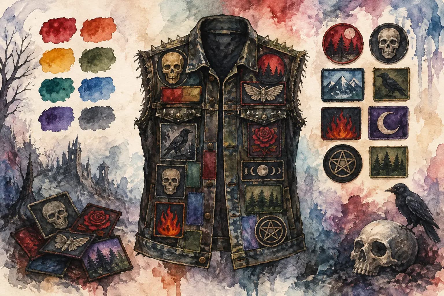
Watercolor illustration of a studded denim vest covered in skull, raven, rose, and pentagram patches beside a color swatch palette and matching patch thumbnails.
A killer patch can disappear completely once it lands beside the wrong neighbor. A black-and-white logo next to a busy full-color print, a red border fighting a red flannel panel, three dark patches swallowed by black denim - these are the placement problems that make a battle vest feel muddy instead of intentional. Learning how to balance patch colors is less about following a fashion rulebook and more about making sure every patch you chose can actually be seen.
Your kutte does not need to match. It needs to read. The goal is a layout where the eye can move across the jacket without getting stuck in one overloaded area or missing half the bands represented there.
Start With Your Jacket Color
The jacket is the background for everything else, so treat it like the biggest color field in the design. Blue denim, black denim, gray denim, leather, camo, and dyed jackets all change what will show up clearly.
Classic blue denim is forgiving. Black, white, red, yellow, and full-color patches usually have enough separation from the fabric to work. Black denim looks mean as hell, but it demands more attention: black patches with dark artwork can blend into it unless they have a bright border, white logo, metallic thread, or enough empty space around them. On a light denim vest, pale patches may need a dark edge to avoid looking washed out.
Leather creates its own situation. It is generally dark and reflective, so high-contrast woven patches and embroidered borders tend to read better than low-detail printed art. That does not mean every patch needs to be bright. It means your darker pieces need placement that gives them room to exist.
Before arranging anything, spread your patches over the garment and look at them from a few feet away. That distance matters more than how they look in your hand at the merch table.
How to Balance Patch Colors Without Matching Everything
Color balance is not the same as symmetry, and it definitely does not mean making every section identical. A battle jacket can be chaotic, densely packed, and full of clashing band art while still feeling visually balanced. What you are looking for is distribution: light and dark areas, loud and quiet colors, and detailed and simple graphics should be spread across the garment.
Start by identifying your dominant colors. Maybe most of your collection is black with white logos. Maybe you have a pile of red thrash patches, vivid death metal backpatches, or old-school printed rectangles in faded yellow and orange. Once you know what shows up most, avoid stacking all of it in one zone.
If your backpatch is mostly red and black, you do not need to ban red from the rest of the back. Instead, use smaller red patches at different points around it so the color feels repeated rather than trapped at the center. A red chest patch on the front or a small red logo near a lower back corner can connect the whole garment.
Think in visual weight, not just color names. A small neon-green patch can pull more attention than a larger black patch. A white logo on a black rectangle is visually heavy even if the patch itself is not large. When one piece is especially loud, give it breathing room or balance it on the other side with another strong element.
Use contrast to make logos readable
Contrast is what makes a patch visible at a glance. It can come from color, brightness, border color, texture, or scale. A black logo on dark blue denim may work if it has a thick white outline. A detailed full-color patch may work on black denim because its art contains enough light tones. A gray-on-black woven patch can look great up close and vanish from the pit photo.
This is where a grayscale check earns its place. Remove color from the equation and look at the light-to-dark values. If several neighboring patches become one dark blob in grayscale, they will probably compete in real life too. Shift one of them, add a lighter patch nearby, or leave a small amount of jacket showing between them.
Grayscale does not tell you everything. Two patches with similar brightness but clashing colors can still fight. But it quickly exposes layouts that rely on color alone while losing all contrast.
Let repeated colors travel around the jacket
A layout often feels accidental when a strong color appears once and nowhere else. If you have one bright blue patch on an otherwise black-and-red vest, it can look isolated. That may be exactly what you want, especially for a favorite band or a focal point. If it feels unplanned, repeat that blue somewhere else with a smaller patch, border, pin, or piece of stitching.
You do not need perfect pairs. Repetition can be subtle. A yellow band logo on the upper back may be echoed by a tiny yellow detail near the front pocket. A white-heavy patch on one shoulder can be balanced by a white logo lower on the opposite side. This creates a path for the eye without turning your vest into a checkerboard.
Build Around the Backpatch First
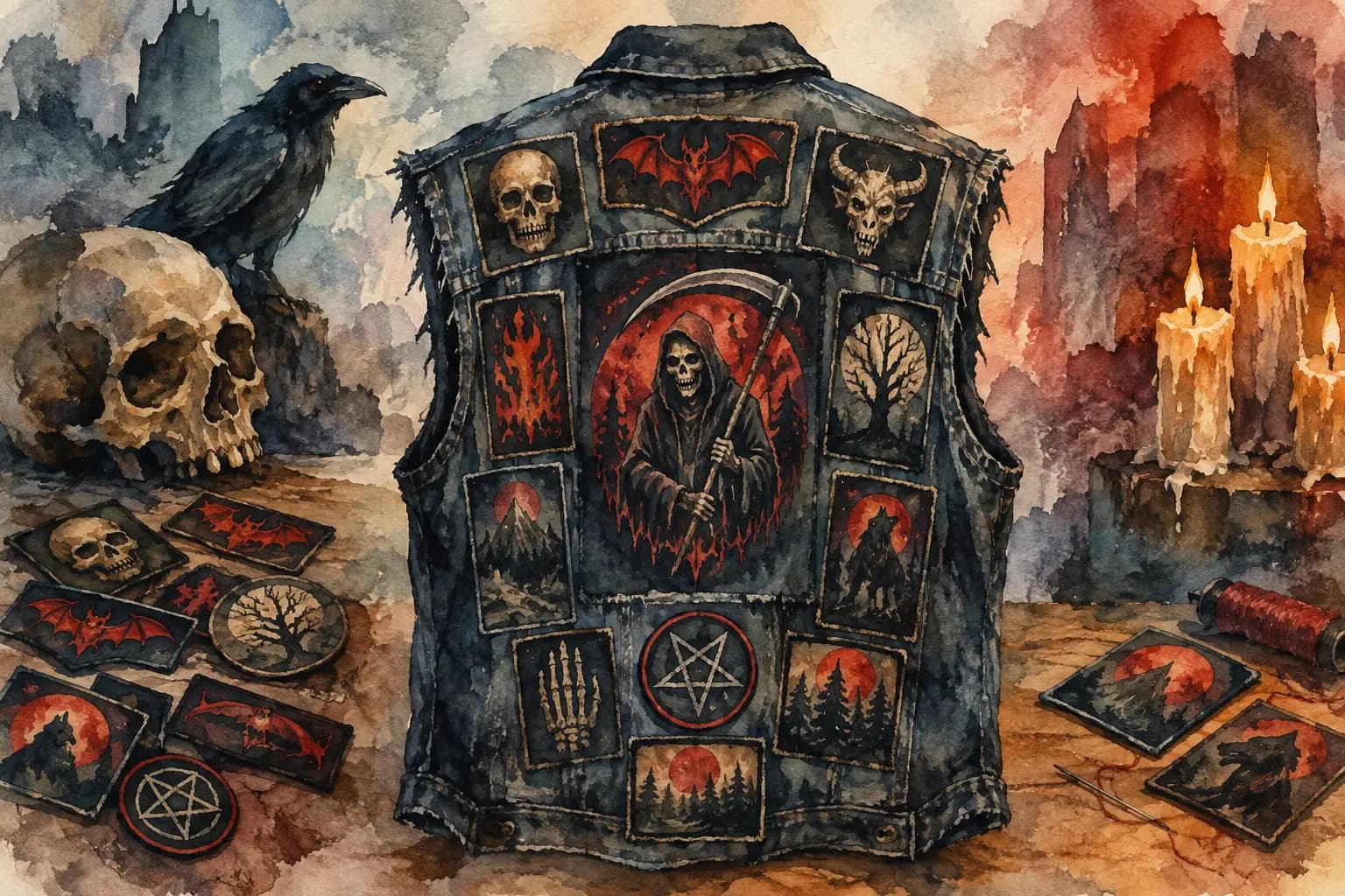
For most battle jackets, the backpatch sets the color direction. It is the largest artwork, the main focal point, and the piece people see first when you are walking into a show. Place it first, then use its colors to make decisions about the surrounding patches.
A bright, detailed backpatch usually benefits from quieter neighbors. Black-and-white logos, narrow strips, and darker rectangles can frame it without trying to outshine it. If the backpatch is mostly black and white, you have more freedom to bring in color around it, though a cluster of equally bright patches can still steal its impact.
Pay attention to borders. A backpatch with a thick red or white edge already has a strong frame. Surrounding it with patches that also have bold borders can create a crowded, boxed-in look. Leaving a little denim visible, or using irregular-shaped patches near the edges, can loosen the composition.
The upper back and shoulder area is especially high-visibility. Do not put every loud patch there just because it fits. Save visual energy for the lower back, side panels, or front so the entire garment has something going on.
Balance the Front as Its Own Design
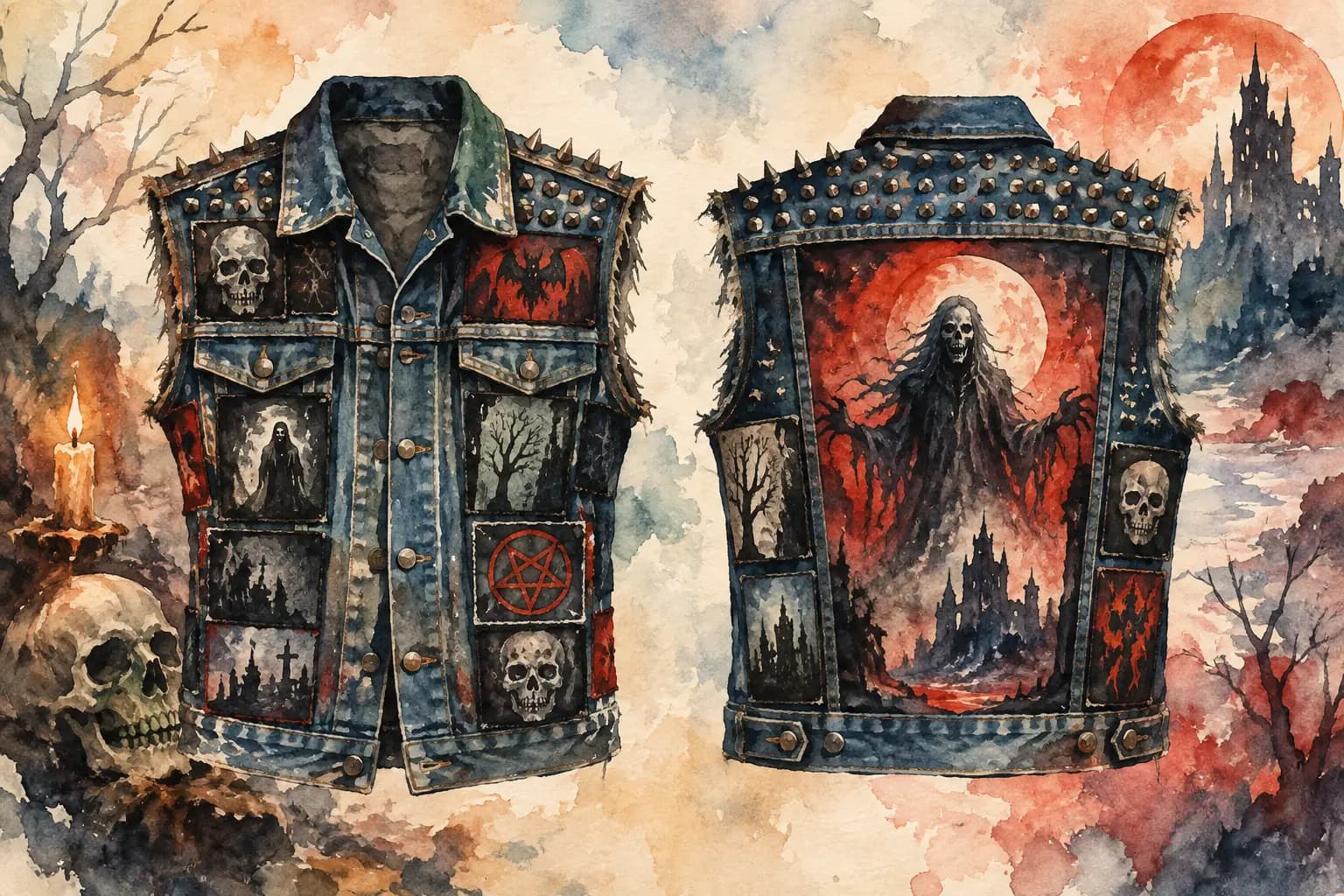
The front does not need to mirror the back. In fact, it usually should not. Front panels are broken up by pockets, seams, buttons, zippers, and lapels, which means patch color needs to work in smaller pockets of space.
Chest patches are seen close up, so detail matters more here. A dark patch that gets lost from across the room can still work on a chest panel if it has sentimental value or rewards a closer look. Use brighter or higher-contrast patches near the collarbone, pocket edge, or lapel if you want the front to hit immediately.
Try not to place all light patches on one front panel and all dark patches on the other unless you are deliberately going for an uneven split. A little imbalance is natural. One side can carry a larger patch while the other uses two smaller pieces, as long as their combined visual weight feels close enough.
This is also where pins, studs, painted details, and thread colors can help. White stitching around a dark patch or a row of silver studs beside a muted one can create definition without introducing another large block of color.
Watch the Gaps, Not Just the Patches
Denim showing between patches is not wasted space. It is contrast, pacing, and a way to keep individual designs from collapsing into one visual mass. This matters most when patches are similar in color or packed full of detail.
You can pack a vest tightly and still keep it readable by varying the shapes and leaving narrow channels of fabric between similar pieces. Two black rectangular patches pressed edge to edge can look like one large, confusing graphic. Turn one slightly, separate them with a strip patch, or put a lighter design between them.
Spacing also changes color intensity. Three red patches touching each other create one huge red zone. Spread them out and they become recurring accents. Neither choice is wrong. It depends on whether you want a uniform wall of color or a layout with more movement.
Test the Layout Before You Sew
The easiest way to avoid color regret is to plan the arrangement before thread touches denim. Lay everything out on the jacket, take a photo in normal light, then look at it on your phone. A camera often reveals visual problems your eyes ignore while you are holding the vest.
Try a few versions. Move the brightest patch from the shoulder to the lower panel. Rotate a rectangular patch. Replace one dark patch beside the backpatch with a lighter one. Check the layout in grayscale, then switch back to color. Small changes can make a crowded design feel deliberate.
The Black Thread lets you test those moves without committing to them, using jacket colors, front-and-back views, rotation, scaling, and grayscale contrast checks. Build the layout, step back from it, and adjust until the patches look like they belong together on the same garment.
Do not chase a perfectly balanced vest if that is not your taste. A lopsided wall of black-and-white logos, one aggressively bright shoulder, or a deliberately messy collision of colors can all look right when it reflects the music and scene that built it. Give your strongest patches room to speak, make sure the ones you care about can be seen, and then sew the jacket that feels like yours.