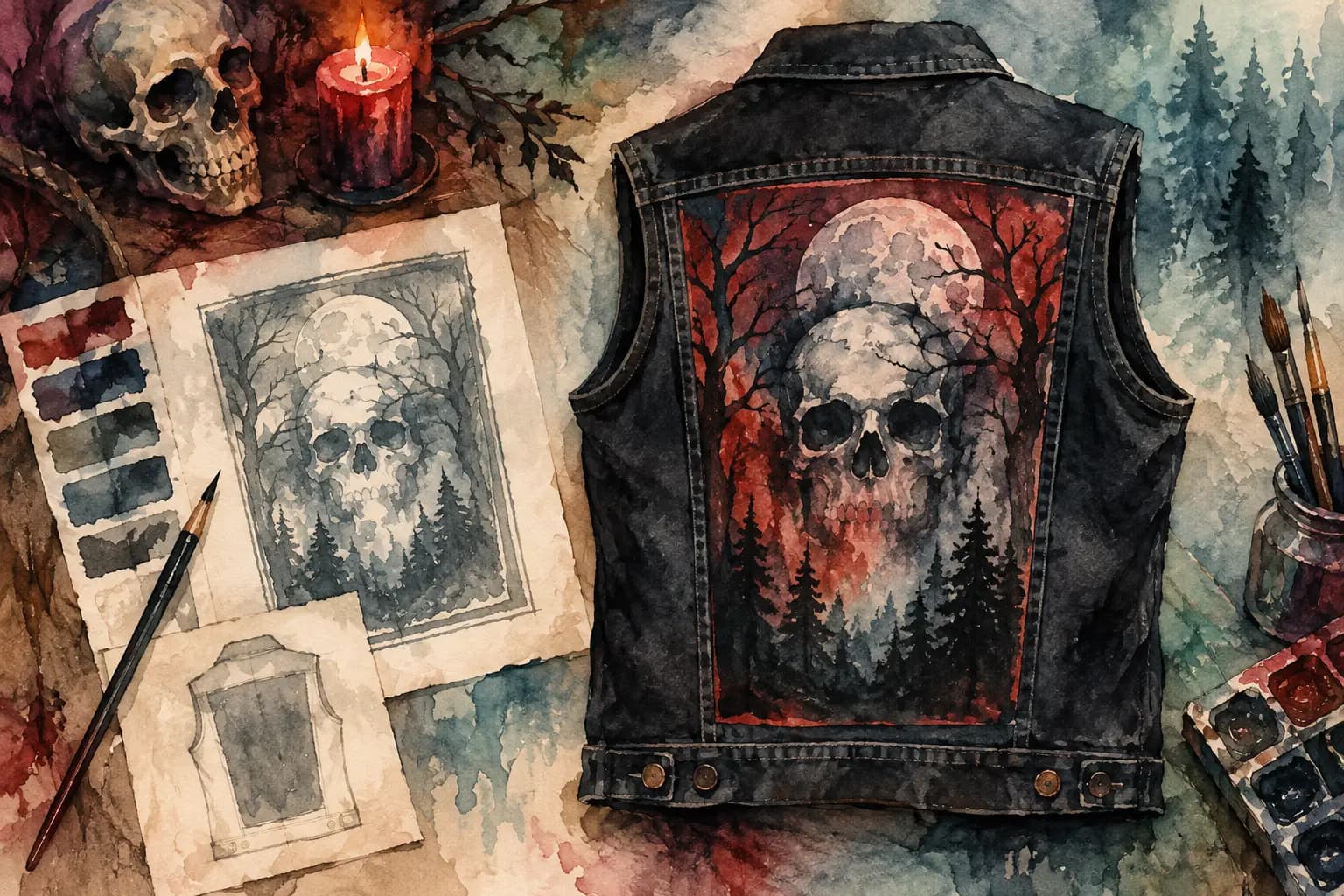
Chest Patch Placement Guide for Battle Vests
Learn how to map chest zones, balance visual weight, and test layouts before committing patches to your vest or jacket permanently.
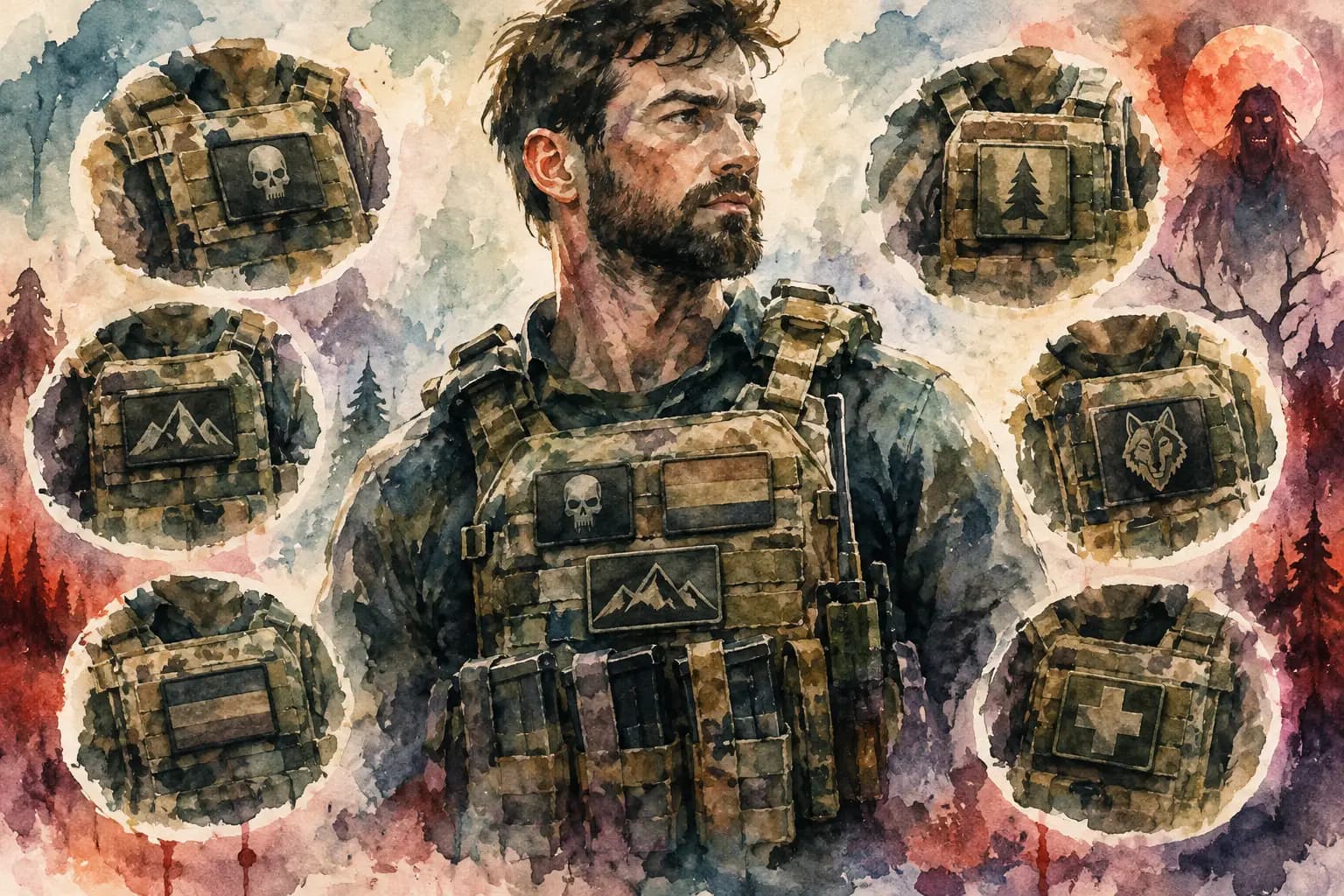
Watercolor illustration of a man in a tactical patch vest surrounded by circular close-ups of individual chest patches
A chest patch can look perfect on your worktable and completely wrong once the vest is on your body. Pockets shift, seams pull, collars fold, and a patch that looked centered on flat denim may end up crowding your armpit. This chest patch placement guide is about avoiding that moment before you commit with thread, glue, or a sewing machine.
The front of a battle vest is where people read the details up close. It carries the bands you have been spinning lately, the labels that shaped you, political patches, weird art, gig memories, and the smaller pieces that make a kutte feel personal. There are common placement habits, but no strict rules. Your jacket belongs to you. The goal is to make the layout feel intentional and wearable.
Start with the jacket, not the patch pile
Before choosing a chest position, put the jacket or vest on. Stand normally, move your arms, sit down, and look at where the garment naturally bends. The usable chest area is smaller than it appears when the denim is laid flat.
On a standard denim vest, the main front zones are the left and right chest panels, the pocket flaps or pocket faces, the space under the collar, and the area between the buttons and side seams. Leather jackets may have zippers, lapels, snaps, and angled pockets that break those zones into smaller shapes. Treat hardware as part of the design, not an obstacle to ignore.
A good starting point is to leave enough clearance around the armhole and center opening that the patch will not crease hard every time you move. If a woven patch reaches into the curved edge near the armhole, it may curl or catch sooner than a patch set slightly inward. That does not mean every patch needs a huge empty border. It means the garment needs room to behave like clothing.
Measure the real estate
Use a flexible tape measure to record the width and height of each front panel. Measure from the center button line or zipper edge to the side seam, then from the shoulder seam or collar area down to the pocket and lower body. Write down the dimensions, especially if you are building around patches you have not received yet.
The two sides rarely offer identical usable space. A zipper, an angled pocket, a pen slot, or a label can change the geometry. Symmetry can look great, but forcing it on an uneven jacket can make the front feel more awkward, not less balanced.
Chest patch placement guide: choose a visual anchor
Most front layouts need an anchor: one patch, feature, or area that establishes the visual weight of that side. It might be a rectangular band patch over the left chest, a large embroidered logo on the right, or the jacket's original pocket kept visible as a deliberate blank space.
Chest patches usually work best when they follow the line of the garment. A horizontal logo tends to look natural when it sits level with the pocket flap or parallel to the shoulder seam. A round patch can sit a little higher or lower without looking out of place. Tall vertical patches need more caution because they can run into pocket edges and make the chest panel feel cramped.
Think about visual weight, not just patch measurements. A black patch with a small white logo may physically be large but visually quiet. A bright red patch with dense artwork can dominate a panel even at half the size. If you place the loudest patch on one side, give the other side enough weight through a larger design, a group of smaller pieces, or visible hardware.
There is no requirement to mirror the two chest panels. Plenty of strong battle jackets use a packed left side and a more open right side. The balance comes from how the whole front reads, including collar pins, pockets, buttons, and the backpatch that will carry the main focus when you turn around.
Work with pockets or remove them
Pockets are one of the biggest decisions in front patch planning. Keeping them gives you useful space and a classic denim-vest structure. Patching over them creates a more dense, built-up look, but it can sacrifice function and make sewing more difficult.
A patch on a pocket flap is a solid choice for a small rectangular logo, mini backpatch, or name strip. Keep the flap's movement in mind. A thick embroidered patch may prevent it from closing cleanly, while a thin printed patch is usually easier to manage. If you want to use the pocket itself, test whether you can still reach inside after stitching only the patch edges.
Removing pockets opens a larger, flatter canvas, which helps with oversized chest patches. It also leaves stitch holes, faded outlines, and sometimes uneven denim underneath. For some builders, that worn evidence is part of the DIY character. For others, it becomes a distraction. Check what your specific garment looks like before cutting anything off.
Plan the order before you sew
Front patch placement is not just about where every patch lands. It is about what must go down first. Large patches that sit under smaller pieces should be attached before the overlap. Patches near pocket corners, seams, and collar edges need to be tested before you fill the surrounding gaps.
Lay everything on the garment and take photos from straight on, at a slight angle, and while wearing it. A flat-lay photo is useful for spacing, but a worn photo tells you whether the placement lands too high, too low, or too close to your arms. Use painter's tape, safety pins, or fabric clips for the test layout. Avoid pinning through delicate printed patches if you can help it.
This is where a digital mockup can save a lot of frustration. The Black Thread lets you arrange uploaded patches on front and back jacket templates, adjust scale and rotation, and check real-world measurements before you start sewing. It is free to try without an account, so you can move a patch ten times on screen instead of unpicking it ten times from denim.
Check the layout in grayscale
Color can hide a weak layout. If several patches have the same darkness, they may blend into one block from a few feet away, even if the artwork is different. A grayscale check helps you spot whether light logos, white borders, and high-contrast designs are spread across the front or all piled into one area.
This matters most on black denim and black leather, where black-bordered patches can disappear until someone is standing close. That can be the look you want. If you are building a low-contrast, all-black vest, commit to it. If you want each patch to read clearly, alternate dark and light values as you place them.
Leave room for the jacket to grow
The temptation is to fill every gap immediately. A packed front can look killer, especially on a long-running vest, but empty space is not a mistake. It gives larger patches room to breathe and leaves you somewhere to put the band you discover six months from now.
Keep future patch shapes in mind. A narrow vertical gap can be useful for a small logo strip but useless for a standard rectangle. A pocket-sized open area gives you options. If you already have a large patch collection, sort it by shape before finalizing the layout: rectangles, circles, shields, long strips, and odd cuts each solve different spacing problems.
Also consider the garment's lifespan. Heavy embroidery, layered patches, and lots of metal hardware add weight. On thin thrifted denim, an overloaded chest panel may sag or pull at the shoulder seams. Reinforce the inside with scrap denim if needed, especially behind a large patch or a cluster that crosses a weak area.
Common chest placement mistakes
The most common problem is placing patches too close to the center opening. On a button-up vest, this can make logos split visually when the jacket is open or pull apart when it is closed. Give the button line breathing room unless you intentionally want a patch to bridge both sides.
Another is setting both chest patches at exactly the same height without looking at the pocket lines. Exact alignment can work, but it can also create a stiff uniform effect. A slight offset often feels more natural, particularly when one patch is round and the other is rectangular.
Finally, do not ignore comfort for the sake of a full layout. Thick patches directly under backpack straps, seat belts, or where your arm rubs can wear faster and feel annoying at shows. Save the toughest, flattest patches for those high-friction spots, or shift the placement by an inch before sewing.
Make it look like your jacket
A chest layout does not need to follow anyone else's formula to look right. You can build a clean, symmetrical metal vest with matching panels, a chaotic punk front full of overlap and studs, or a mostly bare jacket with a few patches that mean everything to you. The best placement is the one that still feels good when you pull it on after a hundred wears.
Before the needle goes through the denim, wear the mockup around the room, look at it in a mirror, and trust the version that makes you want to take it to the next show.