8 Battle Vest Layout Examples That Actually Work
Eight proven ways to arrange a battle vest's back and front, from a centered backpatch to a theme-driven collage, so you can plan before you sew.
Watercolor illustration of eight tactical-style plate carrier vests arranged in two rows of four against a dark gothic graveyard backdrop with a skull, raven, and full moon.
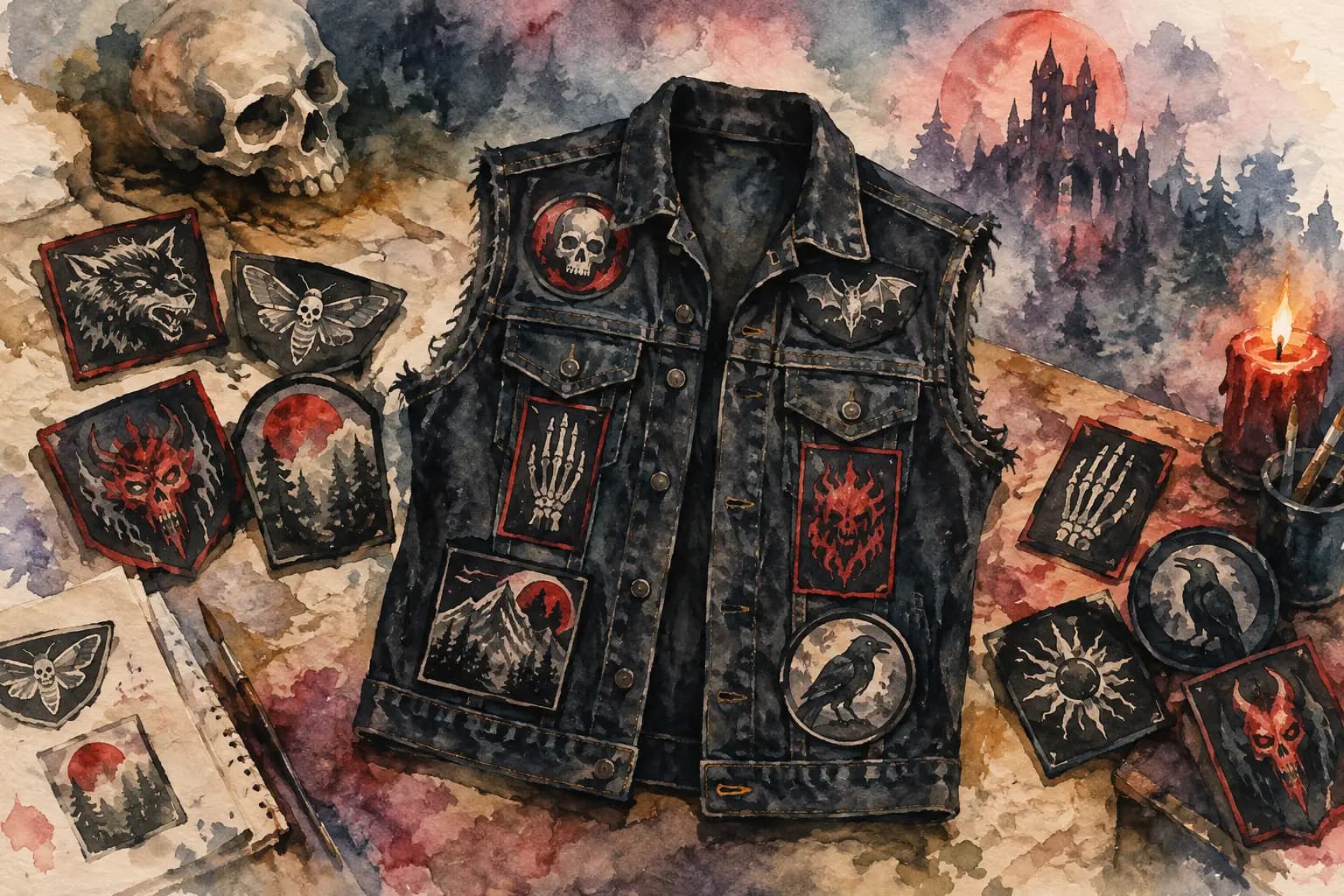
A battle vest is not a billboard where every empty inch needs filling. The best battle vest layout examples make your patches readable from a few feet away, keep the garment wearable, and still leave room for the weird, personal details that make a kutte yours. Start with a plan before the needle comes out. It is much easier to move a patch on a screen or a flat surface than to unpick tight stitches from denim.
Start With the Back, Not the Empty Space
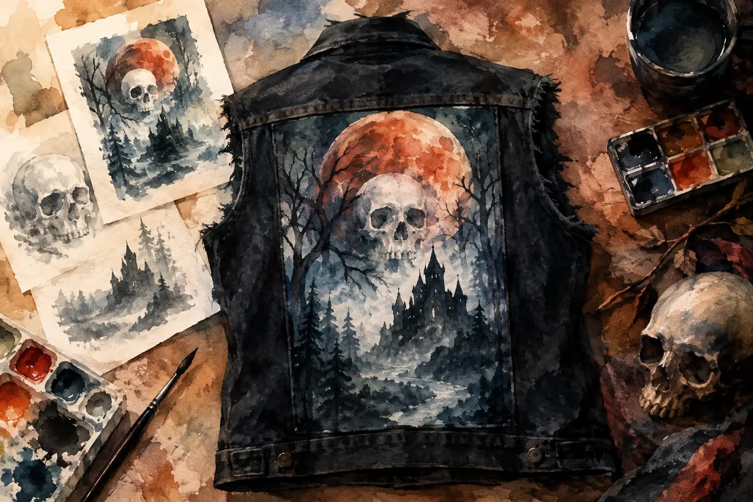
The back is usually the visual center of a battle jacket or vest. For most builders, the backpatch sets the scale, color palette, and general attitude of everything around it. A large logo, album art patch, screen-printed panel, or handmade piece can all work, but each calls for a different supporting layout.
Before adding smaller patches, put the backpatch in place and check three things: how much seam clearance it needs, whether it sits level between the armholes, and whether its artwork still reads when the vest is worn. A patch can look centered on a flat jacket yet pull sideways once it wraps around your back. Leave a little breathing room near side seams and avoid stitching through bulky seam layers when possible.
If you have not chosen a centerpiece, do not force one. A dense all-over back can be just as strong, especially for punk, crust, hardcore, or a vest built around small printed patches rather than a single band statement.
1. The Classic Centered Backpatch Layout
This is the layout most people picture first: one large backpatch centered across the upper back, with smaller patches building outward beneath and beside it. It works because the main image gets instant attention, while the surrounding patches add depth without competing with it.
Keep the first row below the backpatch relatively even. That does not mean every patch must be the same size. A long rectangular patch on one side can balance two small squares on the other. The goal is visual weight, not rigid symmetry.
This layout is ideal if you have one patch you genuinely want to be the vest's main statement. It is also forgiving for a first vest because you can expand downward over time.
2. The Full-Coverage Back
A full-coverage back treats the whole panel as a patch collage. Small woven patches, printed rectangles, circular logos, and odd shapes overlap or nest together until very little denim remains. It looks loud, lived-in, and especially good on a vest with years of show pickups and trades behind it.
The trade-off is readability. If every patch has intense artwork, fine text, and similar colors, the back can turn into visual static. Break that up by mixing patch sizes and leaving occasional narrow lines of denim between clusters. Black-and-white patches are useful here because they create contrast against colorful artwork.
Lay out the biggest pieces first, then use the small patches to solve awkward gaps. Do not start with tiny pieces. They disappear fast, and you may later wish you had saved that space for something with more presence.
3. The Split-Panel Layout
For a vest without a traditional backpatch, divide the back into two or three deliberate zones. One approach is a vertical arrangement: a tall patch, logo strip, or hand-painted panel down the center, with smaller patches on either side. Another is a top-and-bottom split, using a wide patch across the shoulders and a denser patch field below.
This style suits narrow back panels, long patches, or collections that do not include a single oversized centerpiece. It can also work around jacket details such as yokes, pleats, or a center seam. Let the construction of the garment inform the layout instead of fighting it.
Battle Vest Layout Examples for the Front
The front has different jobs than the back. It needs to move when you sit, bend, wear a backpack, or close the vest. It also contains lapels, pockets, buttons, zippers, and seams that can make a beautiful flat layout frustrating to sew.
A practical rule: save the most detailed patches for areas that stay visible when the vest is open. If you usually wear it unbuttoned, the lapels and upper chest are prime real estate. If you button or zip it often, avoid placing important artwork where the closure splits it in half.
4. The Balanced Chest Layout
This is the familiar metal vest front: one or two patches on each upper chest area, usually arranged around pockets or just above them. It feels intentional without becoming formal. You might put a favorite band logo over the left chest and a contrasting shape, pin cluster, or smaller logo over the right.
Balance does not require matching bands, matching patch shapes, or equal measurements. A large rectangular patch over one pocket may balance a circular patch and two pins on the other side. Check the overall silhouette from arm's length, not only the exact geometry.
Avoid placing thick patches directly where backpack straps rub if you travel to shows with a pack. Those spots receive a lot of friction, especially on softer woven edges.
5. The Asymmetrical Punk Front
An asymmetrical front gives you permission to make one side busier, taller, or more personal than the other. Maybe one lapel is covered in pins and political patches while the other side has only a few band logos. Maybe one chest panel carries a scene patch, a memorial piece, or a hand-painted strip.
The key is making the imbalance look chosen. Build a strong cluster on one side, then leave purposeful negative space on the other rather than scattering random patches everywhere. This approach works particularly well on black denim, faded denim, and leather, where hardware and texture already contribute to the composition.
6. The Pocket-Frame Layout
If your jacket has chest pockets you want to keep functional, frame them instead of covering them. Run narrow patches above the pocket flaps, add small squares beside the pocket edges, or place a longer piece just below the pocket line.
This is a smart layout for first-time builders because pockets give you natural boundaries. It also makes measuring easier: align patch edges to the pocket seam, not just the center of the garment. Remember that pockets can puff outward. Test placement with masking tape or pins before sewing.
Build Around Shape, Color, and Wear
A strong vest layout is less about following rules than noticing conflicts before they become permanent. Two great patches can look wrong together because their borders fight, their lettering is the same scale, or their colors blend into the denim.
Use shape as a planning tool. Long patches can create rows and borders. Circles soften a field of rectangles. Skinny strips work well along yokes, side panels, or beneath a backpatch. Irregular handmade pieces make natural focal points but usually need a little open space around them.
Color matters from a distance. A red logo on black denim may hit hard, while dark blue ink on black can vanish in low light. Check your design in grayscale as well as full color. If every patch turns into a similar gray value, the layout may need a lighter border, a brighter patch, or more exposed denim to create separation.
The Black Thread's Battle Jacket Builder is useful here because you can switch between front and back views, scale patches to real-world measurements, rotate them, and test the balance before you commit to thread. You can start planning without an account, then save a design if you want to keep refining it later.
7. The Theme-Driven Layout
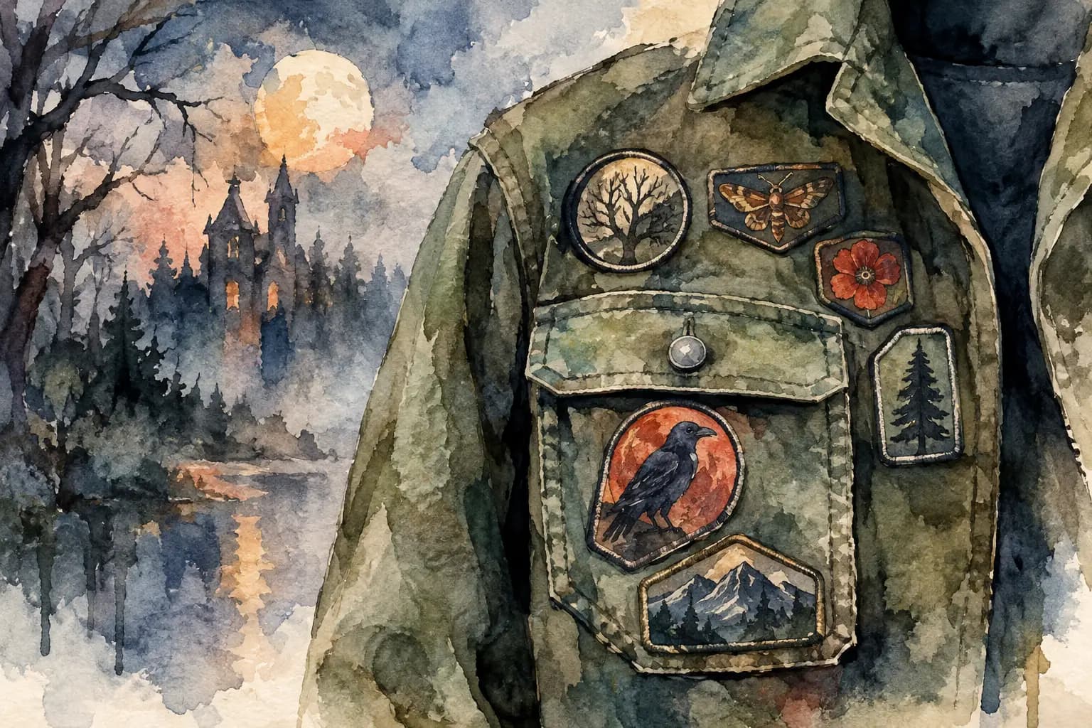
A theme-driven vest is not necessarily a single-genre vest. The theme can be a color palette, a local scene, a decade, a tour history, horror artwork, political patches, or bands tied to specific memories. A clear thread makes a mixed patch collection feel connected.
Start with two or three anchor pieces that define the theme, then add supporting patches in a way that preserves contrast. A horror-heavy vest, for example, benefits from a mix of dense illustrated art and simpler logos. A black-and-white crust layout can use rough textures and mismatched borders without looking accidental.
Leave room for future finds. A vest that tells your story should be allowed to change when a new record, show, or band actually earns a spot.
8. The Growing Vest Layout
Not every battle vest needs to look finished on day one. A growing layout begins with the backpatch or a few essential front patches and intentionally leaves open panels for later. This is often the most honest route when patches are collected slowly.
Plan the empty areas as if they were patches. Keep enough space for the sizes you commonly buy, and do not fill every gap with tiny leftovers just because it exists. An unfinished-looking area can be better than a cramped one that prevents you from adding the perfect patch next month.
Check It Before You Sew
Pin or tape your complete layout, then put the vest on. Look in a mirror, sit down, lift your arms, and check where patches fold, rub, or disappear under the collar. Photograph the front and back from a few steps away. Your eye will spot uneven rows and awkward dead zones much faster in a photo.
Then ask one useful question: does this look like your vest, or like a layout you copied because it seemed safe? Use the examples as starting points, not limits. The best next patch is the one that belongs on your jacket, even if it breaks the pattern.