How to Design a Readable Backpatch Layout
See how contrast, scale and placement decide whether a backpatch reads clearly across a room or disappears into the denim.
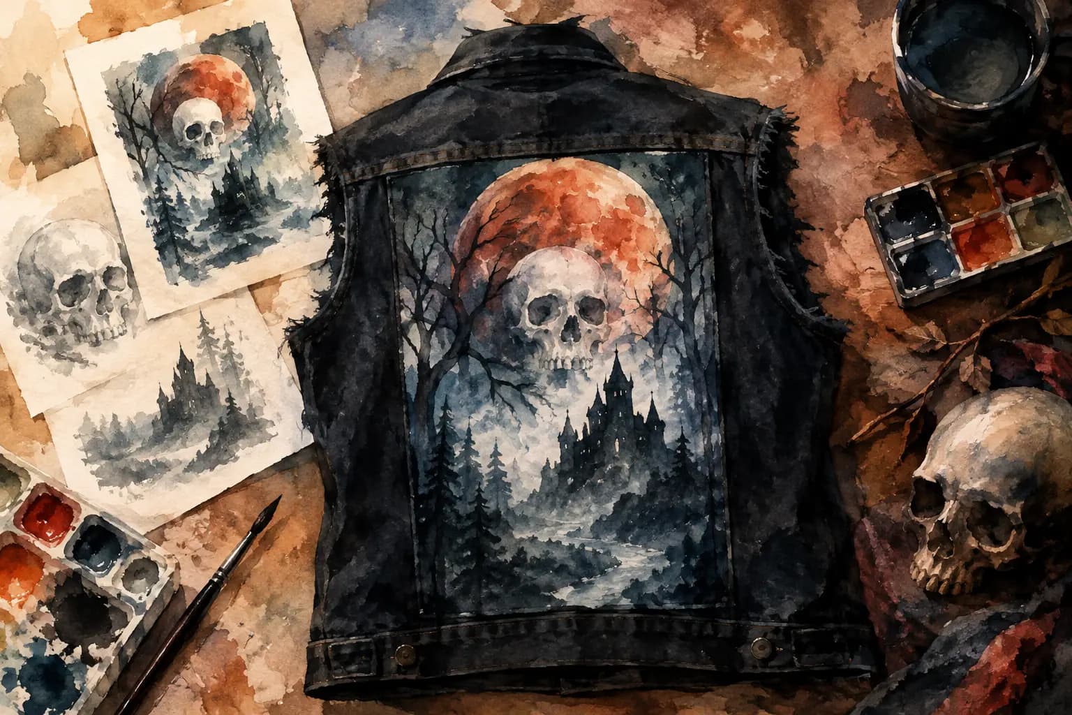
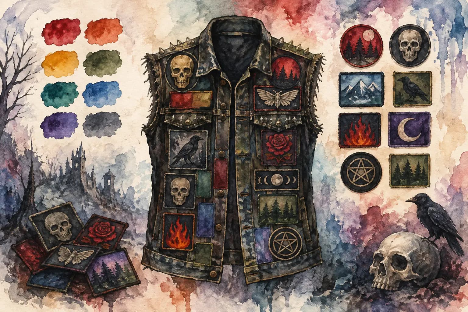
Watercolor-style illustration of a black denim vest with a skull-and-moon backpatch over a misty forest and castle scene, beside concept sketches and paint supplies.
A backpatch can carry the whole jacket, but it only works if people can actually read it. Knowing how to design readable backpatch placement means thinking beyond whether the art looks sick up close. Your favorite band logo, album cover, or custom design needs to hold together from across a venue, in a crowd, and when the denim starts doing what denim does: fading, folding, and picking up years of wear.
There are no strict rules for a battle vest or kutte. A tiny, chaotic backpatch can be exactly right for one jacket, while another calls for huge clean lettering. But if readability is the goal, a few practical choices will save you from sewing on a centerpiece that disappears at five feet away.
Start with the message, not just the image
The first question is simple: what should someone notice first? If the answer is the band name, prioritize the logo. If it is a piece of artwork, accept that the band name may be secondary. Trying to make every detail equally visible is how a strong design becomes visual noise.
Backpatches with clear, high-contrast logos are naturally easier to read than detailed scenes with small text. That does not mean you have to skip the detailed art. It means you should judge it honestly. A dark album cover with black type and a busy background may look great in your hand, yet turn into an unreadable rectangle once it is sewn onto black or dark-blue denim.
For a text-heavy patch, look at the letter shapes before getting attached to the design. Thick, open letters survive distance better than fine script, narrow type, or heavily distressed print. Extreme metal logos are part of the culture, and some are meant to be indecipherable. That is a valid choice. Just treat it as atmosphere rather than readable lettering.
How to design a readable backpatch with contrast
Contrast is what lets a patch stand apart from both its own artwork and the garment underneath. The strongest version is usually light lettering on a dark background or dark lettering on a light background. Bright color can help too, but color alone is not enough. Red type on black, for example, can look intense up close while becoming muddy from a distance.
Think in grayscale before you think in color. If a patch still has a recognizable logo and a clear focal point when all color is removed, it has a good chance of reading well in real life. If everything blends into the same middle-gray mass, the design needs more separation.
Your jacket color matters just as much as the patch. A white border around a mostly black backpatch can create a clean break on black denim. On pale blue denim, that same border may vanish while the dark patch body does all the work. Leather, washed black denim, camouflage, and heavily painted jackets all change the equation.
Before sewing, place the patch against the actual jacket in daylight and take a few steps back. Indoor lighting can flatter low-contrast art. Daylight is much less forgiving, which is useful when you are trying to avoid a permanent placement mistake.
Choose a size that fits the panel
A backpatch should feel intentional, not squeezed between seams or floating in a field of empty denim. Measure the usable back panel rather than measuring the entire jacket. Shoulder seams, yokes, center seams, side seams, and vents can limit where the patch can sit flat.
On a classic denim vest, leave enough clearance at the top that the patch is not bent over the shoulder yoke. Leave room at the sides too, especially if you want to add smaller patches later. A patch that reaches every edge can look massive and commanding, but it may become difficult to sew cleanly and can restrict future layout options.
As a starting point, a backpatch that fills roughly two-thirds to three-quarters of the usable back width often looks balanced. That is not a law. A huge rectangular patch can be perfect for a stripped-down jacket, while a smaller patch may work better on a crowded crust, punk, or grindcore layout.
The important part is scale. Tiny lettering on a wide back panel gets lost. Oversized art with no breathing room can swallow the jacket. Zoom out from your plan and ask whether the backpatch still looks like the main event.
Keep the patch shape working for you
Rectangular backpatches are common because they fit the denim panel well and offer plenty of room for logos or album art. Shield shapes, circles, die-cut logos, and irregular patches can be more distinctive, but they need thoughtful support around them.
A circular patch placed alone in the center can leave awkward empty corners. You can either embrace that negative space for a cleaner look or frame it with smaller patches. An irregular-shaped patch may look best when its edges point toward nearby elements rather than fighting them.
Protect the lettering from folds and seams
A readable backpatch needs a reasonably flat surface. Avoid placing important words directly over a center seam, a deep pleat, or the curved area near the armholes. Every time the jacket moves, those areas can distort the artwork and split the logo visually.
Centering is usually the safest choice for text. It creates an immediate focal point and gives symmetrical band logos a strong home. But centered does not always mean mathematically perfect. Some jackets have uneven seams, worn panels, or hand-painted details that make optical centering more useful than measuring every millimeter.
If your patch has a title or logo along one edge, keep that edge away from the part of the jacket most likely to curl. On many vests, the upper corners and the lower hem take the most movement. Give fine details a little room from those pressure points.
Build a border that does not bury the centerpiece
The patches around your backpatch should support it, not compete with it. This is where a lot of otherwise great battle jackets get crowded. If every surrounding patch has giant white text, bright colors, or a thick embroidered border, the eye has nowhere to land.
Give the backpatch a visible margin, even if it is only a narrow one. Then use smaller side patches, name strips, or shaped patches to lead the eye toward it. A balanced layout does not have to be symmetrical, but it should feel deliberate.
Consider the value of empty denim. Negative space is not unfinished space. It gives a detailed backpatch room to breathe, especially when the artwork is dense. You can always add more patches after a few shows. Removing them after sewing is another story.
Test it at real viewing distance
The best readability test takes less than a minute. Put your jacket on the floor, hang it up, or preview it on a full garment template. Step back six to ten feet. Can you identify the band? Can you tell where the logo begins and ends? Does the art still have a clear shape?
Then check it from different angles. A backpatch may look centered in a flat overhead photo but appear too high once it is worn. Take a picture from behind at chest height, which is closer to how other people will actually see it.
Planning digitally makes this much easier. The Black Thread lets you try patch scale, rotation, jacket colors, real-world measurements, and grayscale contrast before you touch a needle. Use the back view to test the whole composition, then compare it with the front so the jacket feels like one piece rather than two unrelated projects.
Readability is not the same as playing it safe
Some of the best jackets break every neat design guideline. They use illegible logos, rough hand stitching, mismatched patch eras, weird spacing, and art that only reveals itself when someone gets close. That can be the point.
The useful distinction is between intentional chaos and accidental confusion. If you want a black-on-black backpatch because it matches the mood of your jacket, go for it. If you want your favorite logo to be seen across the room, give it contrast, space, and a scale that earns its place.
Plan it, step back from it, and trust what your eyes tell you. The jacket is yours, but a readable backpatch makes sure its message gets heard before the first conversation even starts.