Contrast Checking for Patch Layouts That Sew Well
See your patch layout in grayscale before you sew, so nothing vanishes into dark denim once it's stitched down.
Watercolor illustration of a hand arranging red, purple, black, and gray patchwork squares beside pins, thread, and a lit lantern, with a moonlit haunted house in the background.
A patch can be perfect on its own and still disappear once it hits denim. That is why contrast checking for patch layouts matters before you start sewing. Your battle vest is seen in motion, under venue lights, through beer haze, and from several feet away in a crowded room. If the artwork, border, and jacket all sit at similar brightness levels, a patch that looked great on your desk can turn into visual static.
This is not about following a strict set of fashion rules. A chaotic, all-black crust vest can look killer. So can a jacket packed edge to edge with color. The point is to make those choices deliberately, rather than finding out after you have stitched a rare patch permanently onto the wrong panel.
What contrast actually means on a battle jacket
Contrast is the difference that helps separate one visual element from another. On a kutte, that might be the gap between white lettering and black denim, a red woven border against a faded blue vest, or a bright backpatch surrounded by darker rectangular patches.
Most people think about color first. Color matters, but value matters even more. Value means how light or dark something appears. A deep red patch and a dark green patch may feel completely different in your hand, yet both can read nearly black from across a room. Put them next to each other on a black vest and their artwork can lose definition.
A grayscale preview is useful because it strips away the emotional pull of color. Your favorite band logo might be blood-red, acid green, or printed in an old-school rainbow gradient. In grayscale, you can see whether its lettering still separates from the background and whether the overall layout has enough breathing room.
Contrast is not the same as matching
A high-contrast layout does not need to look polished or coordinated. Metal, punk, rock, and hardcore jackets are personal artifacts, not store displays. A mismatched patch collection can still have strong contrast because different shapes, borders, text sizes, and light-dark values create clear separation.
Likewise, a tightly matched black-and-white layout can have weak contrast if every patch is the same size, same tone, and same density. The goal is not perfection. It is readability and intention.
Start with the jacket color, not the patch pile
The garment is your largest visual field. Before arranging anything, decide whether you are working with black denim, blue denim, gray, olive, leather, or something heavily faded. The same patch can behave very differently on each one.
Black denim gives white ink, pale borders, and bright woven colors immediate impact. It can also swallow dark printed patches, especially designs with black artwork, black borders, and small gray text. Blue denim often gives dark patches more separation, but can compete with blue-heavy art or cool-toned borders. Faded denim is usually more forgiving because its lighter value creates a visible base behind dark artwork.
If you are building on leather, pay attention to sheen as well as color. A patch may look readable in a flat digital mockup but become harder to see when light catches the leather around it. This does not mean avoiding dark-on-dark placements. It means reserving them for areas where subtlety is part of the look, rather than relying on them for your centerpiece.
Contrast checking for patch layouts in practice
Build your layout in color first. This is the fun part: choose your jacket, add your backpatch, move the chest pieces around, and test the weird combination you have been thinking about for months. Then switch to grayscale before treating the design as final.
In grayscale, look at the jacket from the same distance someone else would. Do not inspect every stitch-sized detail yet. First ask whether your eye lands where you want it to land. On most jackets, that is the backpatch, a large central front piece, or a bold chest logo.
If your focal patch blends into the garment, you have options. You can move it to a lighter panel, use a patch with a brighter border, place a lighter patch nearby to create separation, or accept the low-contrast effect and make another element the focal point. A pale outline, a strip of contrasting fabric behind a patch, or a row of lighter pins can also help physically, although those choices change the final jacket more than a digital layout can show.
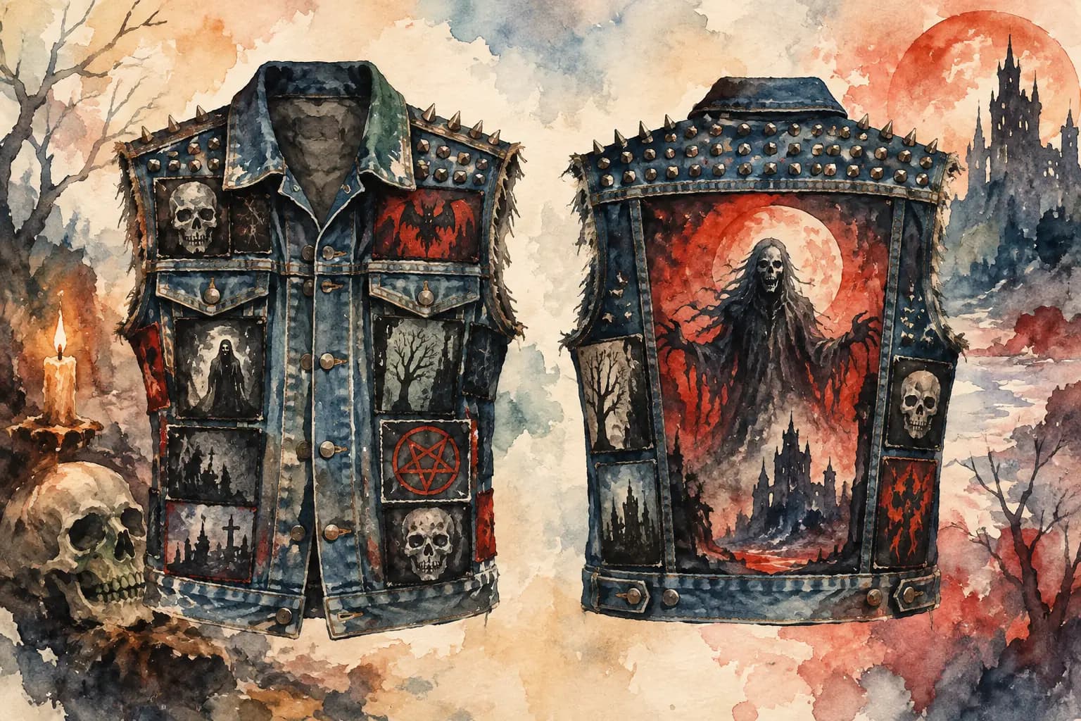
The Black Thread lets you test this without unpicking anything. Arrange patches on the front and back views, adjust their scale and rotation, then use grayscale contrast checking to judge the layout by value rather than color alone. You can begin planning without an account, then save the design if you want to revisit it before sewing.
Check the back as one composition
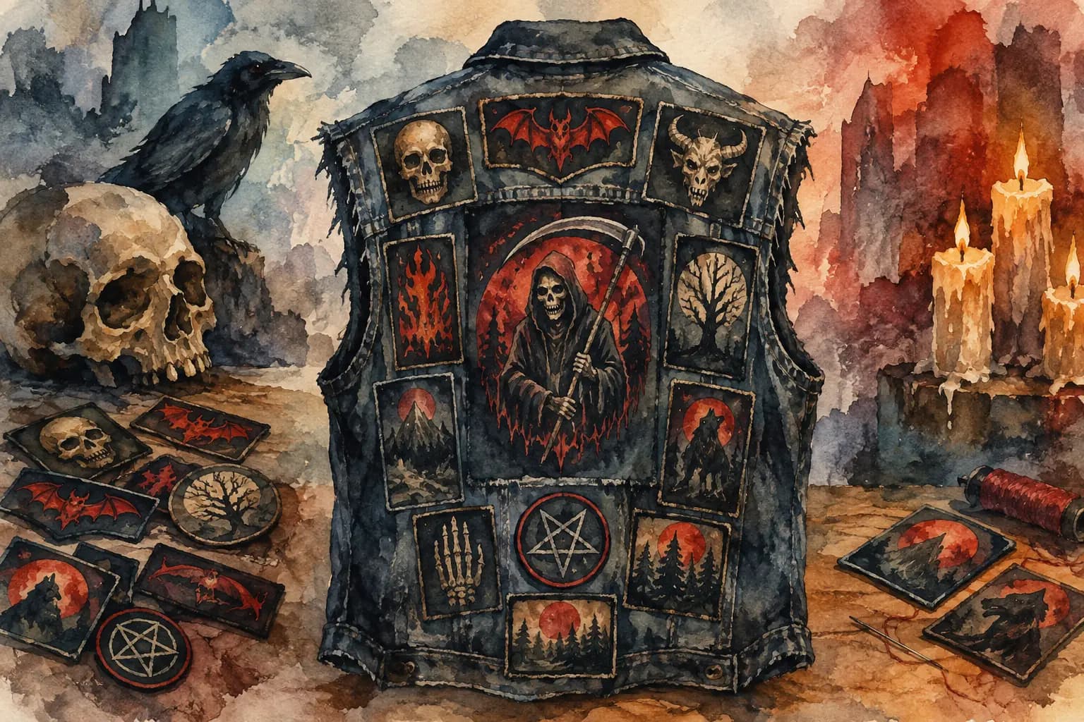
The back is where contrast has the most work to do. A big backpatch often carries the jacket from across the room, but it can get buried when every surrounding patch has a bright border or dense artwork. If the backpatch is detailed and dark, surrounding it with equally dark rectangles may make the whole upper back read as one heavy block.
Try giving the backpatch a little visual space. That does not always mean an empty border. It can mean placing lighter, simpler patches around it, rotating nearby patches so their shapes break up the grid, or keeping the busiest pieces lower on the back.
Pay attention to the vest's seams and shoulder yoke, too. A patch can have excellent contrast but still look cramped if its border collides with a seam or gets pinched beneath the collar. Real-world measurements help here. A layout that fits on-screen should still leave enough material for stitching and for the garment to flex when you wear it.
Check the front in zones
The front is less about one giant statement and more about quick reads. Patches near the lapel and upper chest are often seen first, while lower pockets and side panels reward closer inspection. You can use that difference on purpose.
Keep logos with tiny lettering out of spots that fold, curve, or sit under hardware. A high-contrast patch will not help if a zipper, snap, or pocket flap cuts straight through the band name. Similarly, a vertical patch may look strong beside a pocket but become unreadable if its text runs into a dark seam.
Front contrast also depends on patch formats. Embroidered patches tend to hold their edges well. Printed patches can contain more detail but may have softer transitions, particularly when the design uses dark photographs or distressed art. Woven patches can be sharp and clean, though their fine text still needs enough difference from the jacket to read at a glance.
Fixing a layout that looks muddy
When a grayscale check reveals a muddy area, resist the urge to replace everything. Often one small change restores the whole section. Shift a medium-value patch away from another medium-value patch. Put a light border beside a dark border. Rotate a rectangle so its shape interrupts a stack of horizontal pieces.
Scale can help, too. A cluster of patches that are all nearly the same size often turns into a flat field, even if the colors vary. Let one patch become clearly larger, then support it with smaller pieces. This gives the eye a route through the layout instead of asking it to process every patch at once.
Do not confuse empty space with wasted space. A narrow strip of denim between patches can make the next patch hit harder. On the other hand, if you want a fully armored vest with almost no denim showing, use changes in border color, patch shape, and value to keep the packed layout from becoming one unreadable mass.
Test it like a garment, not a poster
A flat layout is only the first test. Jackets curve around shoulders, fold when you sit, and move when you are in the pit. Before sewing, inspect your design at full view, then zoom into the chest, side panels, and edges of the backpatch. Make sure important text is not too close to a seam and that patches will not overlap in a way that makes stitching miserable.
Think about wear, too. White borders offer strong contrast but show grime faster. Bright patches may fade after years of sun, rain, shows, and washing. That does not make them bad choices. A battle vest is supposed to collect a life. Just know whether you are planning for a clean first impression or a jacket that will age into something rougher.
Your layout does not need to be universally readable to be right. It only needs to say what you want it to say when it is on your back. Check the contrast, trust your taste, save a reference, and sew when the arrangement feels like yours.