What Makes a Backpatch Focal on a Battle Vest?
Scale, contrast, and breathing room decide whether a backpatch reads as the centerpiece or gets lost among smaller patches.
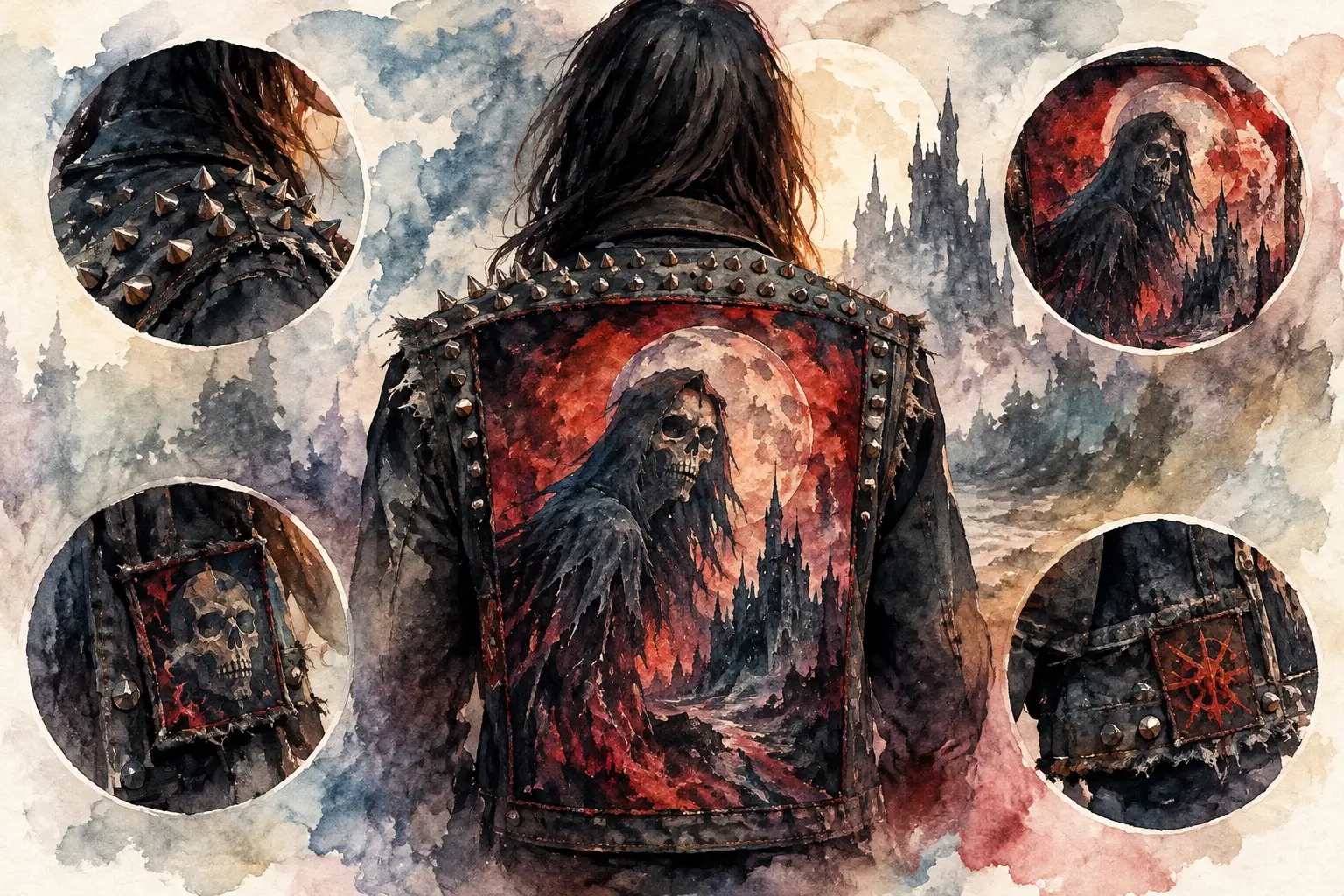
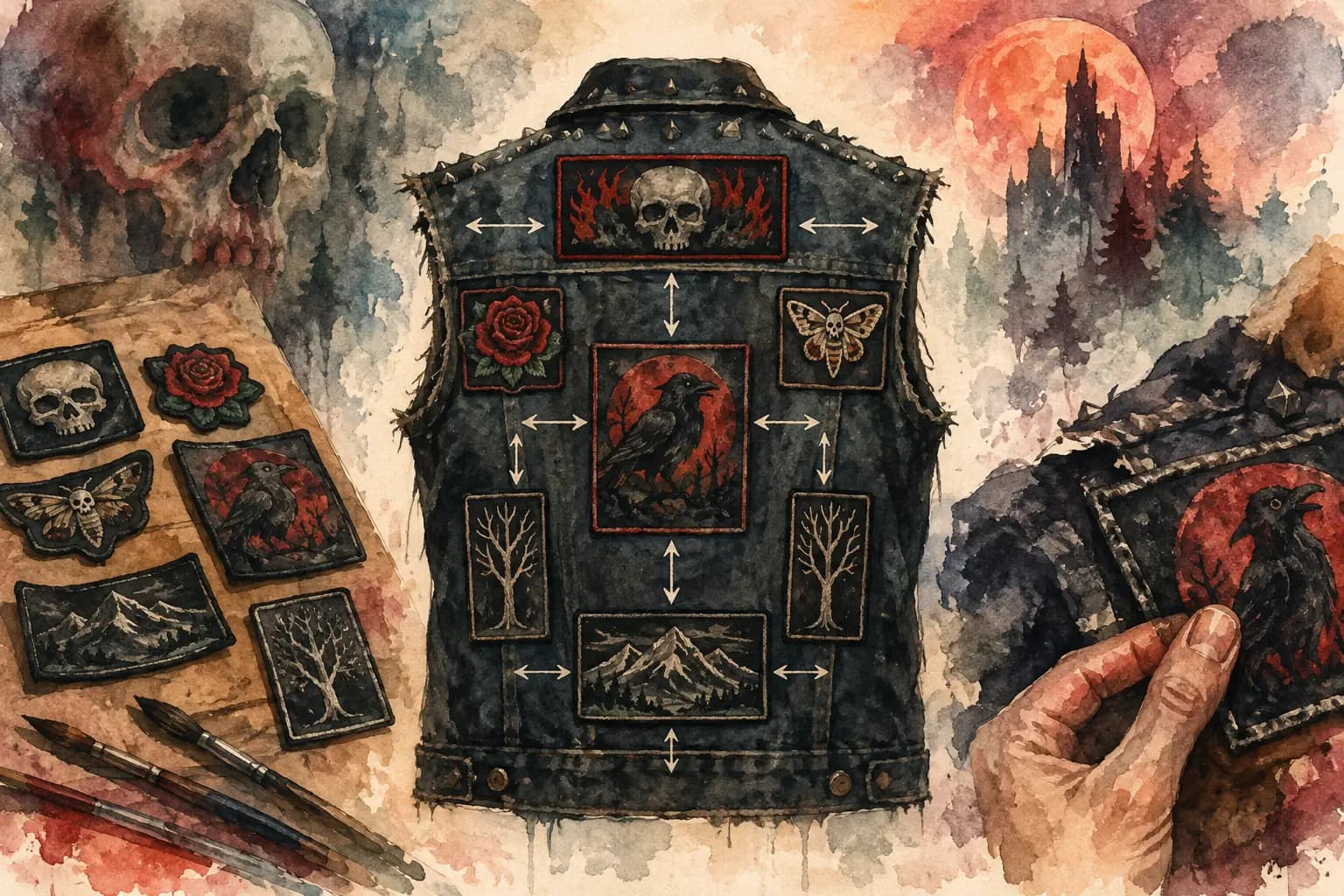
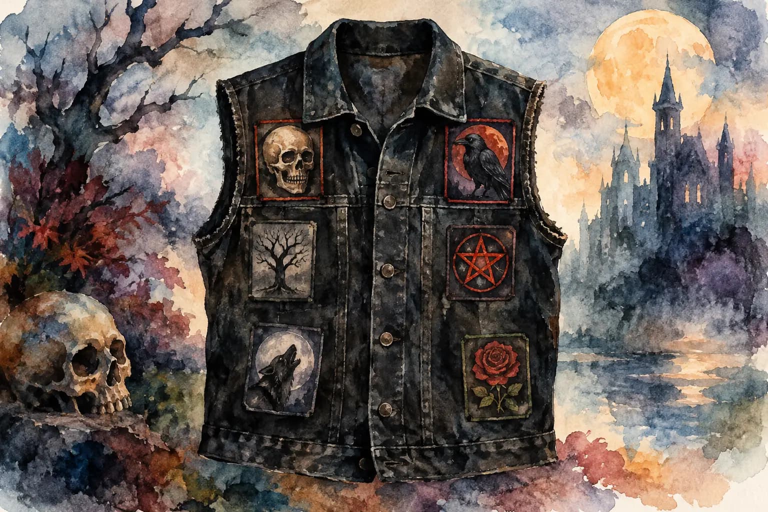
Illustrated denim battle vest with a large red backpatch of a hooded skeletal figure under a blood moon, surrounded by close-up detail shots of spikes and smaller patches.
A backpatch does not become the focal point just because it is large. What makes a backpatch focal is the way it controls the whole back of your jacket: where the eye lands first, how nearby patches support it, and whether its colors and shape stay readable from a few feet away. On a battle vest or kutte, that visual hit matters. Your back is the biggest uninterrupted canvas you have.
The goal is not to make every patch compete at maximum volume. It is to give your jacket a clear center of gravity while leaving enough room for the smaller bands, scenes, causes, and weird finds that make the piece yours.
What Makes a Backpatch Focal?
A focal backpatch has visual authority. Usually, that comes from a mix of size, contrast, placement, and breathing room. It might be a classic rectangular woven patch, a massive printed piece, a shaped logo, or a hand-painted panel. The format matters less than how it works with the denim, seams, and surrounding layout.
Think of it like a band’s stage setup. The vocalist is not necessarily the tallest person onstage, but the lighting, position, movement, and open space tell you where to look. A backpatch works the same way. If it is surrounded by equally large, equally bright patches with no gaps, it can disappear into the noise.
That does not mean a dense patch wall is wrong. Plenty of crusty, overfilled jackets look incredible. It simply means the focal point in that kind of layout may be less obvious. Decide whether you want a single statement piece or a back that reads as one chaotic, collective archive.
Start With Scale, Not Just Size
The first question is not, “Is this backpatch big?” It is, “Is it big relative to this garment?” A patch that dominates a small denim vest can feel perfectly balanced on an oversized trucker jacket. The shoulder width, center seam, yoke, and side panels all change the usable space.
For a traditional centered layout, your backpatch should occupy enough of the upper and middle back that it reads immediately, without swallowing the entire garment. Leave clearance around the armholes and side seams. Those areas flex hard when you move, and a patch pushed too far outward can buckle, warp, or look cramped once sewn.
Its proportions matter too. A wide horizontal patch naturally follows the shape of a vest back. A tall, narrow design creates a stronger vertical pull and may need more open space at its sides. Circular and shield-shaped patches can be striking, but they often need more planning because the surrounding negative space is uneven.
Before you sew, check the patch at the scale it will exist in real life. A detailed album cover that looks sharp on your phone may turn muddy at a small size, while a simple high-contrast logo can own the whole back with less physical area.
Let the garment frame the patch
The most reliable focal placement is centered between the shoulder blades, just below the yoke. This position uses the jacket’s structure as a frame and keeps the patch visible when the vest is worn.
But centered is a convention, not a rule. An offset patch can look intentional and powerful when it leaves room for a shoulder panel, a large side patch, or a diagonal layout. The key is commitment. A patch that is only slightly off-center can look accidental. A clearly shifted placement reads as a choice.
Contrast Is What Makes a Backpatch Focal From a Distance
Contrast is often more important than detail. Under venue lighting, at a show parking lot, or across a crowded room, people read broad shapes and tonal differences before they read tiny artwork.
A mostly white or bright-colored backpatch on black denim will jump forward. A black patch with pale ink can hit just as hard. On blue denim, red, white, yellow, and clean black outlines tend to stand out, while dark navy, black, and muted gray designs can blend into the fabric unless they have a strong border.
Color contrast is only one part of it. Value contrast matters more. Value means how light or dark something looks, even when you remove the color. If your black-and-red patch and your surrounding patches all turn into the same mid-to-dark gray in grayscale, the backpatch may lose its lead position.
A grayscale check is a useful reality check, especially for black metal, death metal, and punk layouts where black, white, gray, and faded denim do most of the work. If the backpatch still reads as the clearest shape without color, your composition has a strong foundation.
Borders, outlines, and empty denim do real work
A white merrowed edge, printed border, or raw denim margin can separate a backpatch from the rest of the layout. You do not need a thick frame around everything, but some visual separation helps the central image hold its shape.
Empty denim is part of the design too. A narrow gap around the backpatch gives it room to breathe and makes the silhouette easier to recognize. If you want a packed jacket, keep that gap tighter but consistent. Random, uneven spacing is more distracting than dense spacing.
Build Supporting Patches Around It
Once the backpatch is placed, treat the patches around it as supporting players. Their job is not necessarily to be smaller, but they should not erase the central patch’s outline or compete with its main colors.
The upper back is the danger zone. Shoulder patches are highly visible, and their angles can either frame the backpatch or crowd it. Long horizontal patches above or below a centered backpatch can create a clean stacked structure. Smaller rectangles, logo patches, and odd shapes at the sides can create a loose frame.
Try to avoid placing another patch with the same dominant shape and nearly the same scale right beside your backpatch. Two giant rectangles with matching bright borders can split attention right down the middle. Sometimes that symmetry is the look you want, especially for a deliberate two-panel design. More often, it makes both pieces feel less special.
A simple hierarchy usually works well: one main backpatch, a few medium patches that establish the layout, and smaller pieces that fill the remaining spaces. This does not mean every patch needs to be neatly ranked. It means the eye has a path to follow instead of getting stuck in a visual traffic jam.
Readability Beats Perfect Symmetry
A perfectly symmetrical back can look clean, traditional, and satisfyingly deliberate. It can also feel too polished for a jacket built from years of shows, trades, and finds. Asymmetry brings energy, especially when patches vary in shape, era, and print style.
What matters is balance, not mirror-image placement. A large bright patch on one side may be balanced by two darker medium patches on the other. A tall vertical design can be balanced by a wide horizontal one. The overall weight should feel stable when you step back, even if nothing matches exactly.
Check your layout from three distances. Up close, look for awkward overlaps, crooked borders, and details hidden by seams. At arm’s length, check spacing and patch relationships. From several feet away, ask one question: does the backpatch still read first?
If the answer is no, make one change at a time. Shrink or move a neighboring patch, create a little more denim around the center, rotate a side piece, or choose a backpatch with stronger contrast. You do not always need to replace the main patch.
Plan for Wear, Not Just a Flat Layout
A vest looks different on a hanger than it does on a moving human body. Shoulder blades pull the upper back outward. Side seams curve. Thick patches can catch or wrinkle if they are forced over heavy construction lines. A focal backpatch needs to survive movement as well as look good in a photo.
Avoid sewing across areas that will distort the artwork, such as a pronounced center pleat or thick vertical seam, unless you are prepared to split the patch or alter the jacket. Leather behaves differently from denim, too. It will not forgive mistakes as easily, and needle holes are permanent.
This is where planning at real-world measurements helps. Lay out your patch at its actual dimensions, then check the edges against seams and armholes before committing. The Black Thread lets you test that relationship on jacket and vest templates, including scale, rotation, front-and-back views, and grayscale contrast, so you can move patches around before your needle does anything permanent.
Let Your Backpatch Say What It Needs to Say
Sometimes the focal patch is your favorite band. Sometimes it is a political statement, a local scene patch, an old tour design, or artwork you painted yourself. There is no universal rule that says the most famous band, rarest patch, or biggest logo deserves the center.
Choose the piece that carries the story you want the jacket to tell first. Then give it enough scale, contrast, and space to be seen. A good backpatch does not need to overpower every other patch on the vest. It just gives the rest of the jacket something to orbit around before you save the layout, start stitching, and let the garment pick up its own history.